SALIVE PRODUCT DESIGN | UX | UI
SALIVE
Year: 2021
Salive was created by Natacha and Lola, founders of the Ravages studio, who are passionate about gastronomy. During the health crisis, the studio lost a large part of its summer business: food events.
They decided to rethink the field of gourmet events, to reach out to restaurants during the Covid 19 crisis, and to offer a new concept to French people in need of travel.
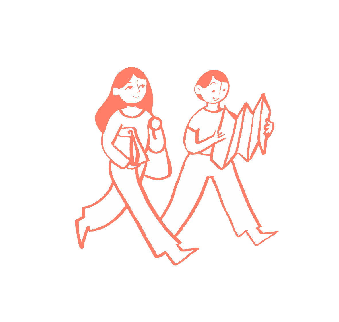
With Salive, they propose to rediscover a district of Paris in more depth, as well as to taste food prepared by local restaurant partners, thanks to the cleverly designed itineraries of the two designers. They also offer home experiences, recipe kits with ingredients delivered to your door.

We noticed that Salive’s instagram was very pretty, but that the site lacked a lot of that energy and dynamism.
First, we had to study the market. Who offers similar products? The biggest competitor here is AirBnB, which offers culinary and cultural experiences. It works a bit more like a marketplace system, everyone may offer their experience, a singing lesson, a walk in the woods, a guided tour of unusual Paris, wine tasting etc…
There are as many experiences as there are people offering them. It may sometimes seem impersonal and without much graphic personality.
The other potential competitors seemed to us to address a much more touristy clientele. Tours of busy areas such as the Marais, near the Eiffel Tower, the Champs Elysées… The photos are very archetypal of a somewhat fantasized Paris, it’s quite clean and mass-market.
It will not be difficult to stand out because Salive offers things that are much more local, more personalized, because it is the founders who create partnerships with the restaurateurs, according to their own tastes.
Natacha and Lola already had some elements for Salive, beautiful illustrations, a strong identity that is part of the revival of Parisian gastronomy in recent years.
We were lucky enough to be able to get in touch with users who had been on the Salive journey, and we interviewed them. As a result, we learned where their frustrations lay, and how we could improve their experience while retaining what they liked about the product.
The majority of feedback we received was that the information was difficult to find on the existing site, the tour pages did not give enough detail about the programme, users felt there was a lack of photographs to whet the appetite.
With all these answers, we created a persona as well as a problem analysis and a hypothesis statement
Persona
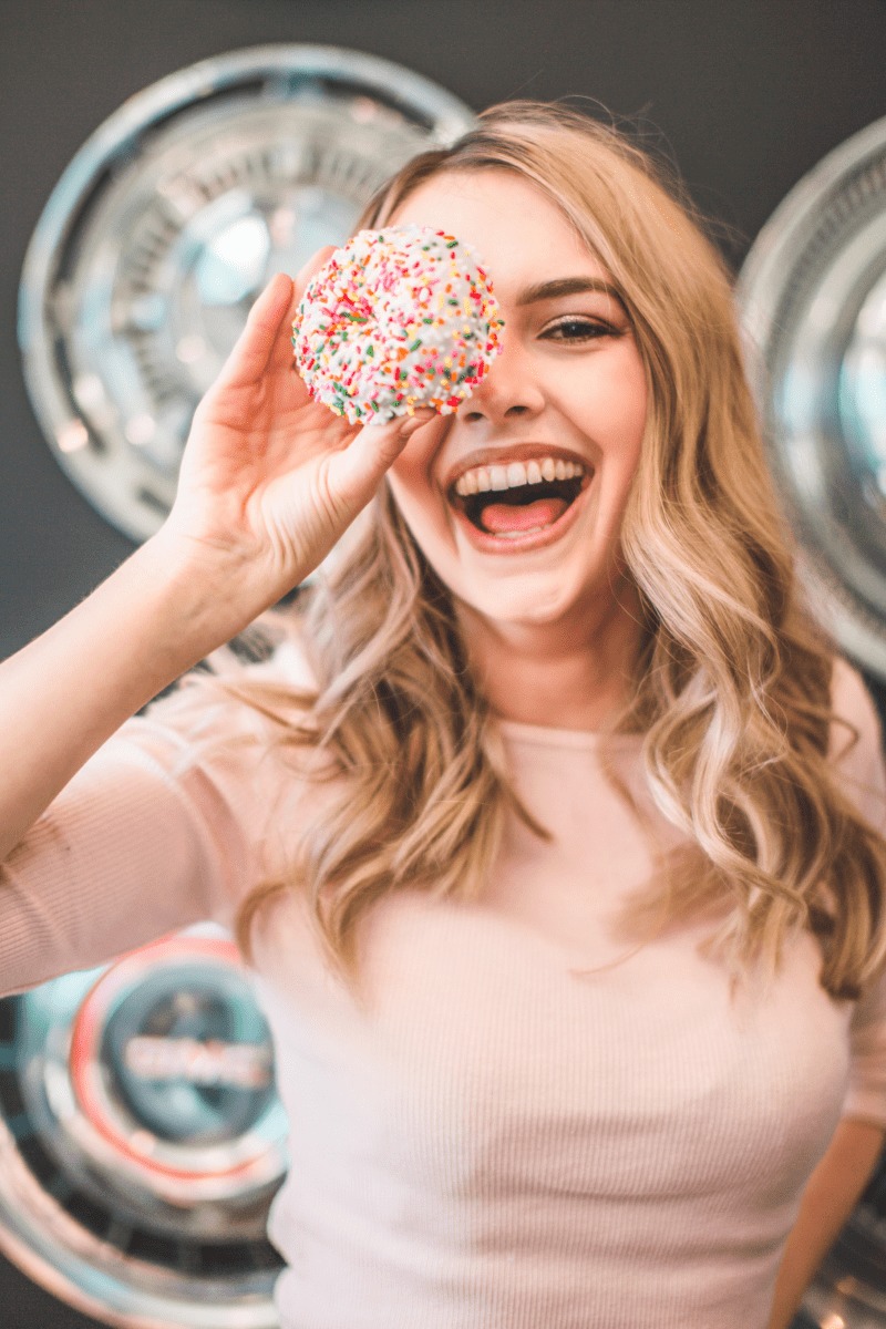
Goals
- Be aware of the best places to go/to eat in Paris
- To discover things in her own neighborhood
- To meet people and learn about the culture of a place
Frustrations
- To be overly guided when visiting or travelling
- To waste her time on a site that doesn't have a polished design
- To go to places where everyone goes
Salive was designed to allow people to buy gastronomic and cultural tours in Paris.
We have observed that the website is not meeting the users needs: find clearly and accurate informations about the products, which is causing a misunderstanding of the concept, a lack of visibility and a lack of profit for our business
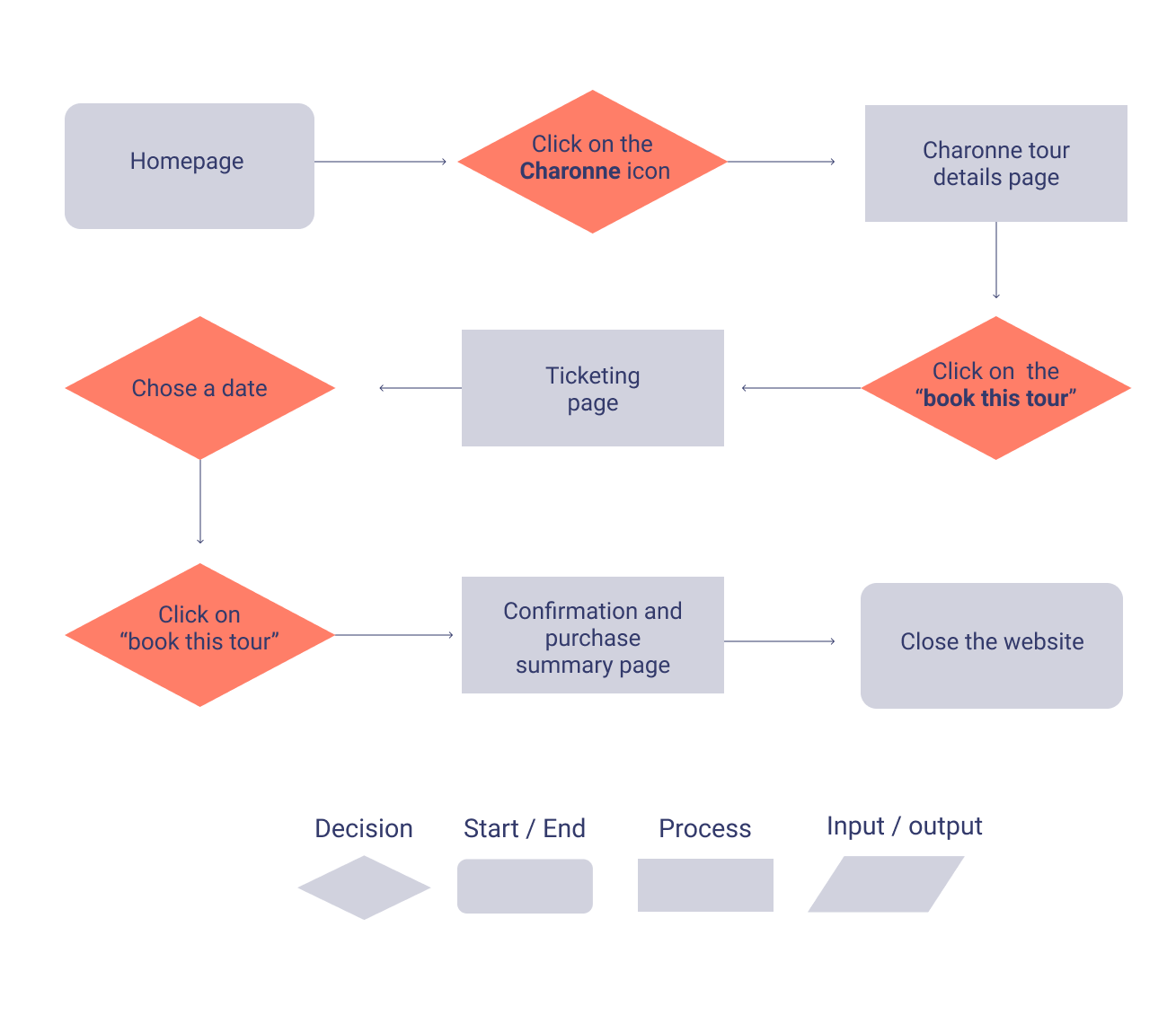
We then created an ideal user path in order to have more insight into the pages to be created and the possible problems the user may encounter during navigation. Does he have access to everything he wants? Does it respond to the issues raised in our interviews? etc...
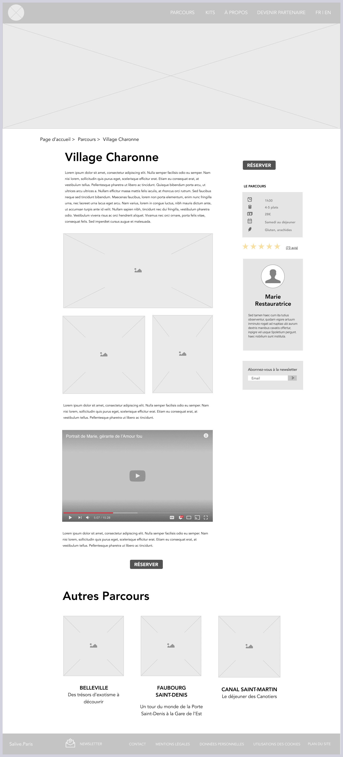
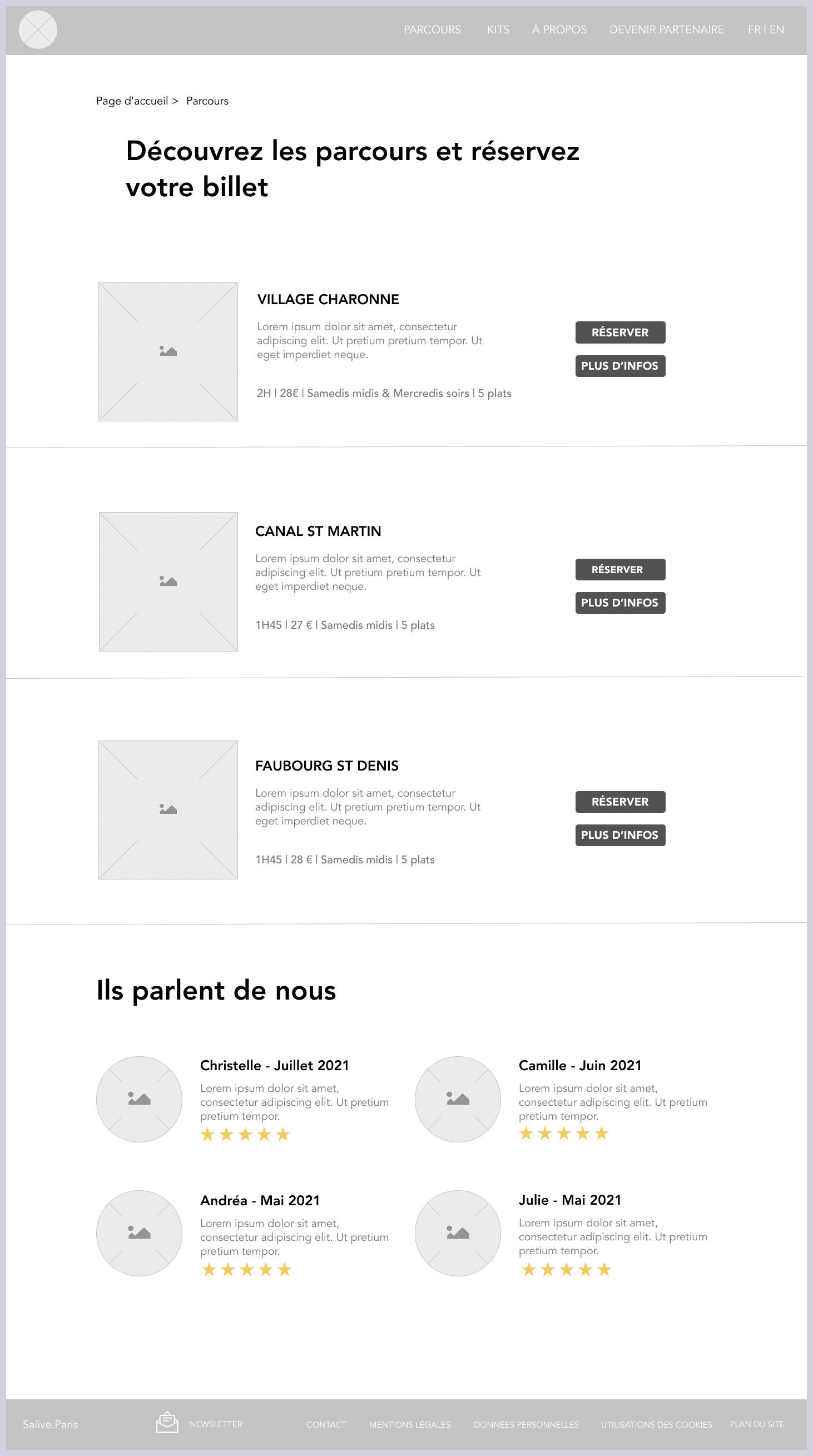
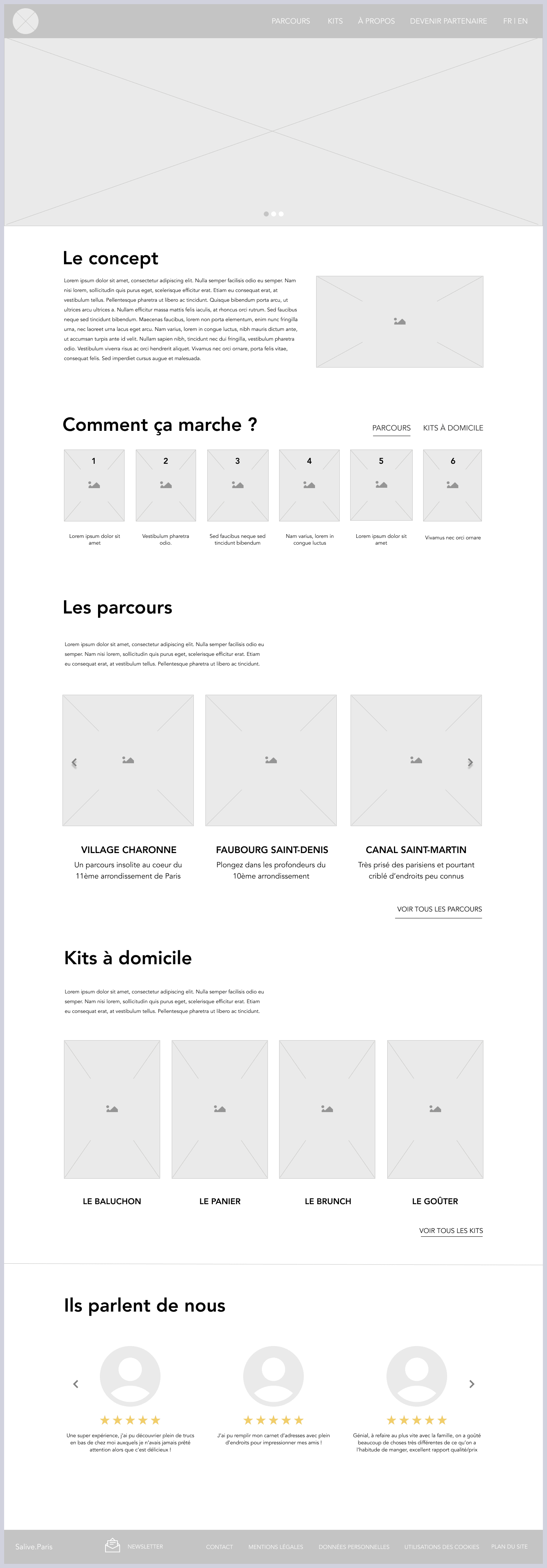
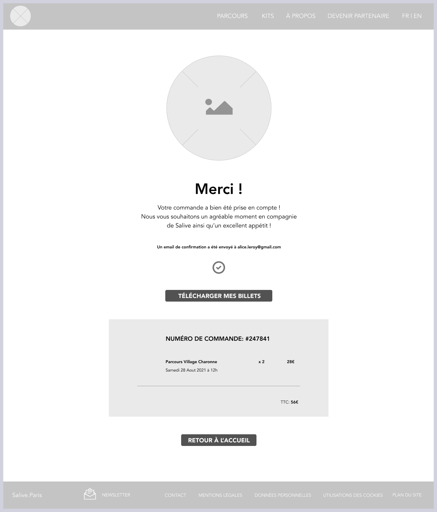
After some sketches and discussions between us, we moved on to creating the medium fidelity wireframes.
We then tested them with users to see if they had any difficulty navigating the site to purchase a tour. This helped us to adjust certain pages, button sizes and even the purchase forms.
Once we were sure of the structure of our project, it was time to apply some colour and establish an artistic direction directly related to the brand.
To do this, we each established a lexical field of what the brand inspired us to do, and then we voted.
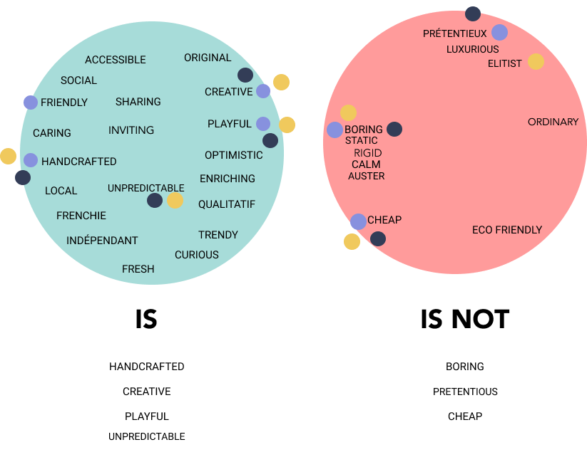
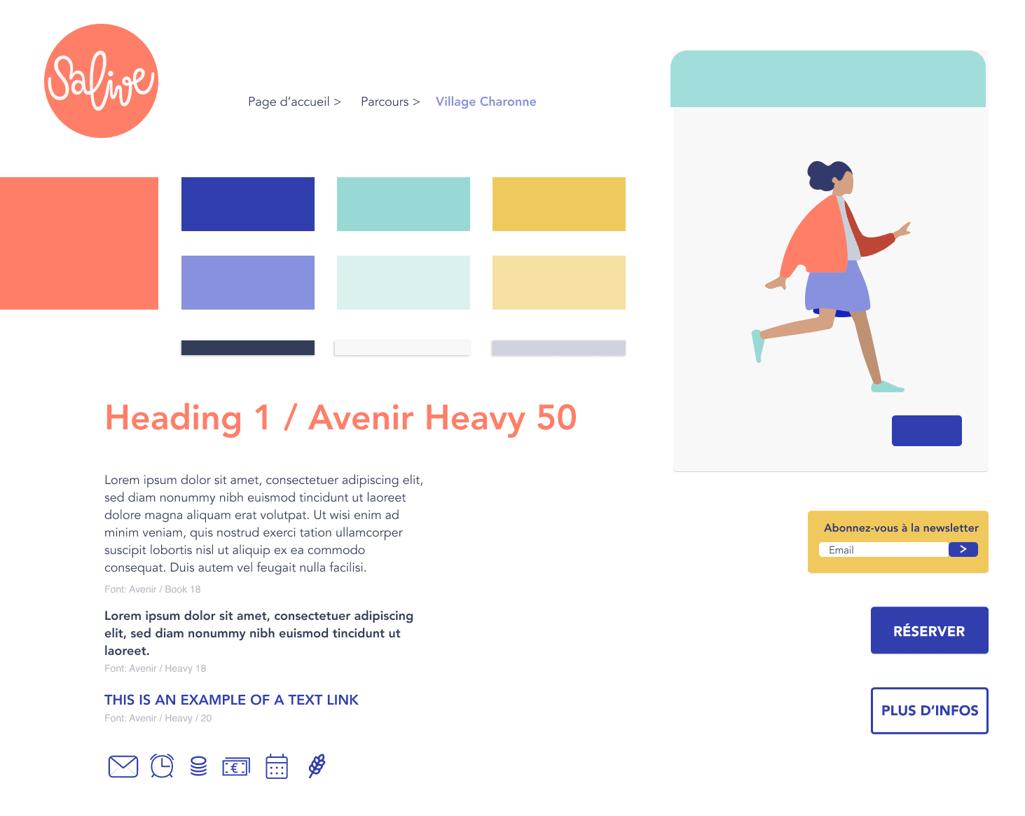
Once we had agreed, we made a moodboard, then a choice of colours related to it.
We chose to keep the colour close to red, which is the original colour of Salive, but we incorporated a bit of orange to make it a bright and modern salmon pink. It is warm, friendly, but less aggressive than a pure red.
Dark blue evokes travel, the sky, the sea, escapades, but also softness and fun when it is pastel light. Why not both? As for the yellow, it is lively, dynamic, tasty, it will be very precious to us to add a little energy to our so wise blues.
The typeface is Avenir, a very modern and timeless sans serif that will fit perfectly with Salive.
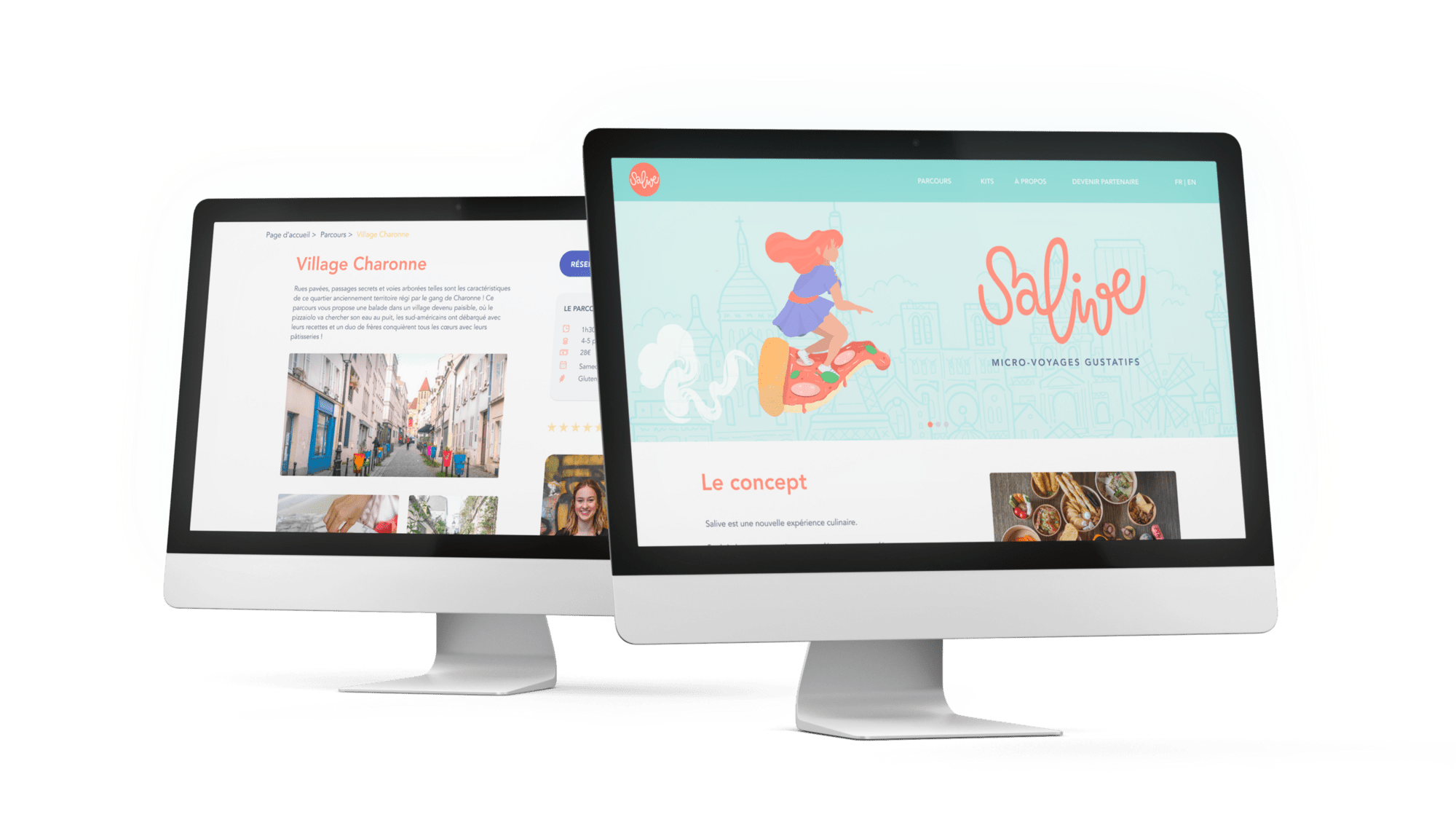
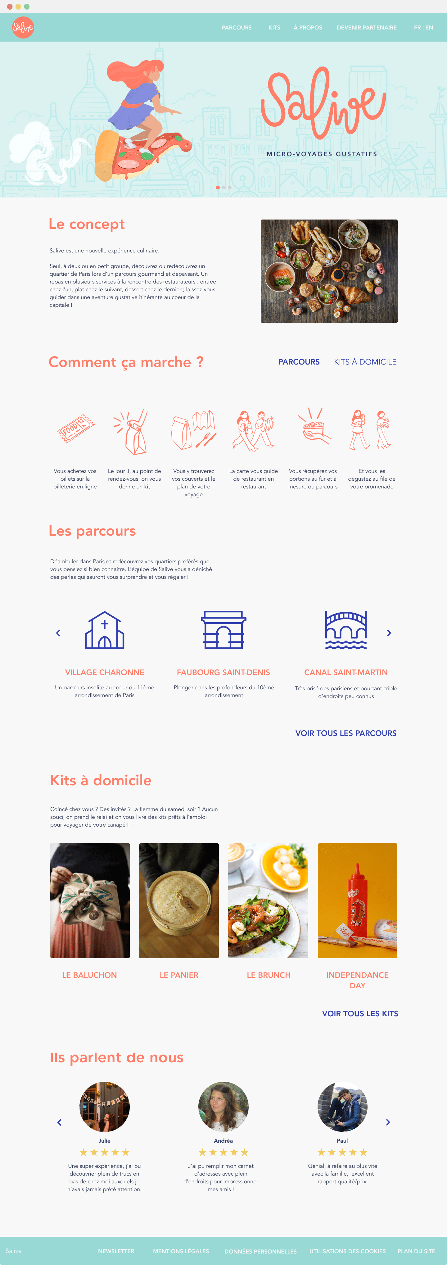
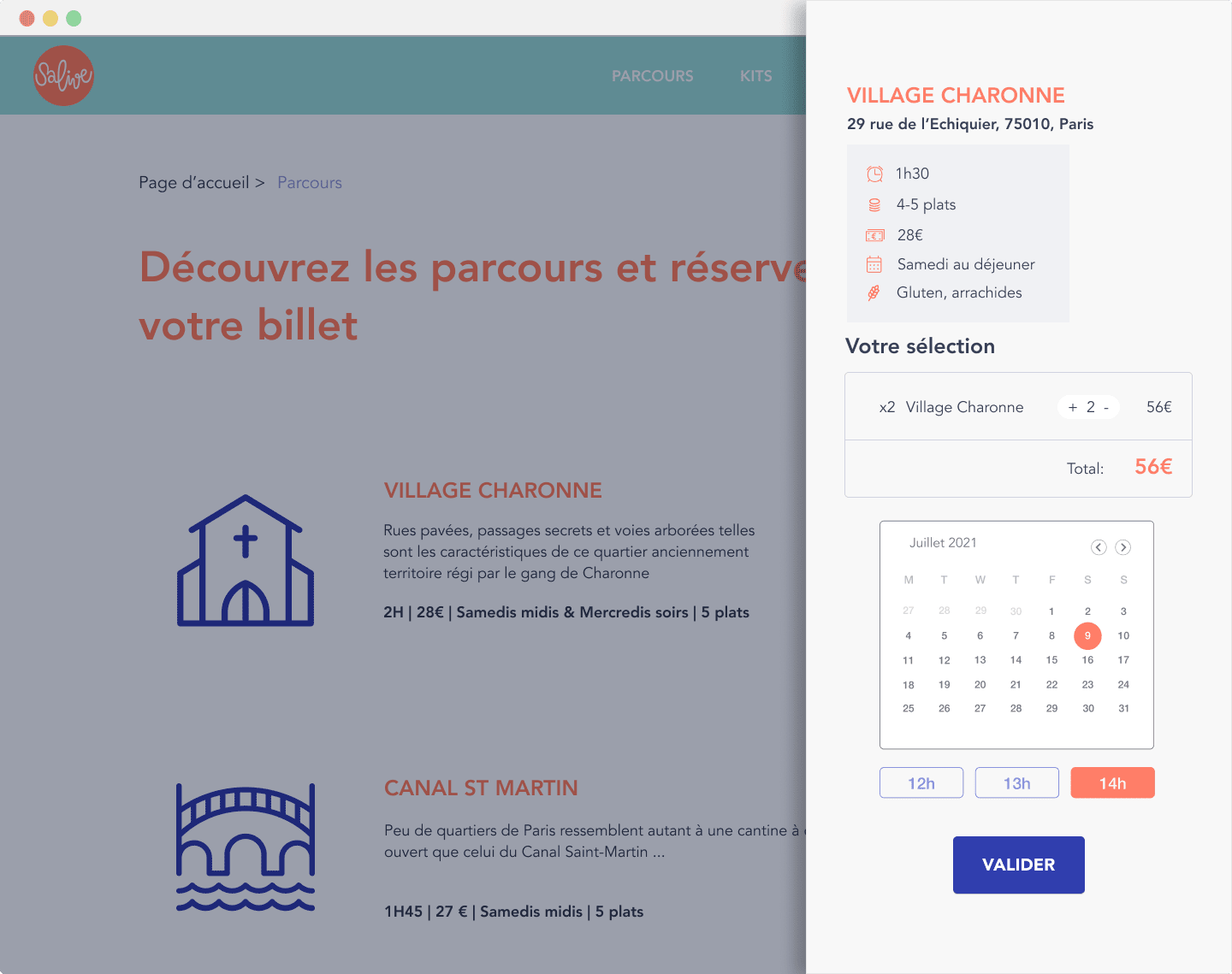
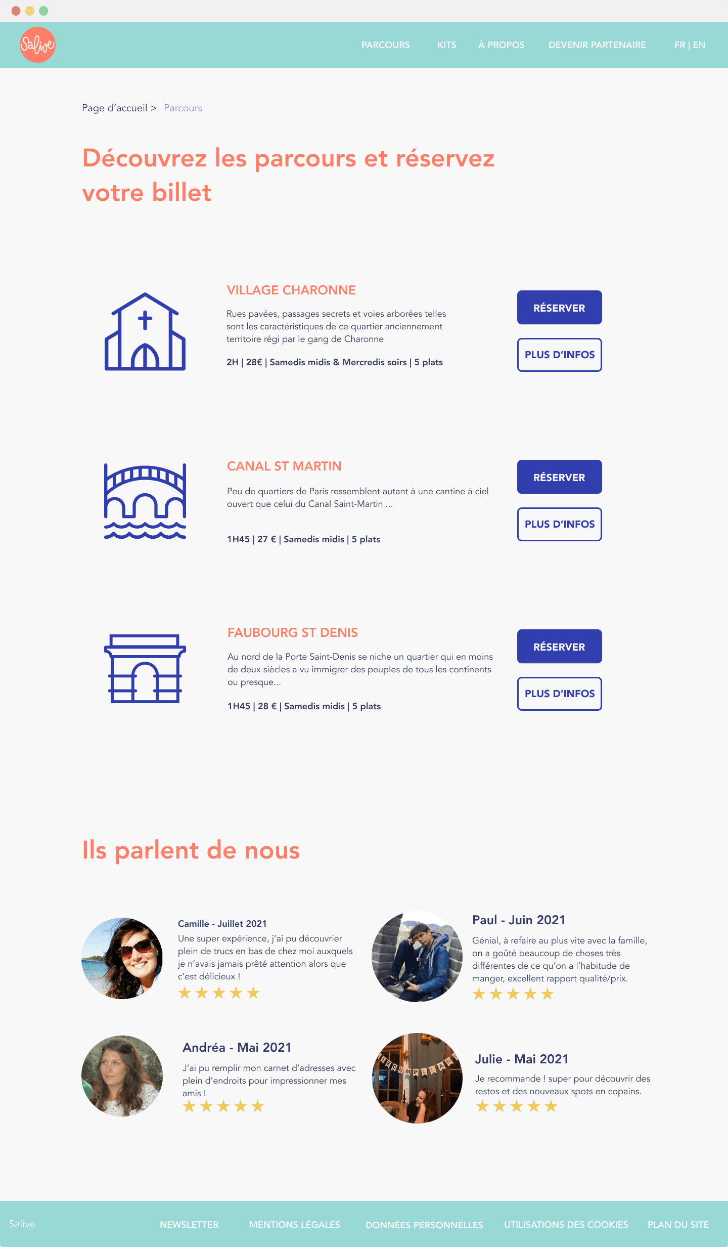
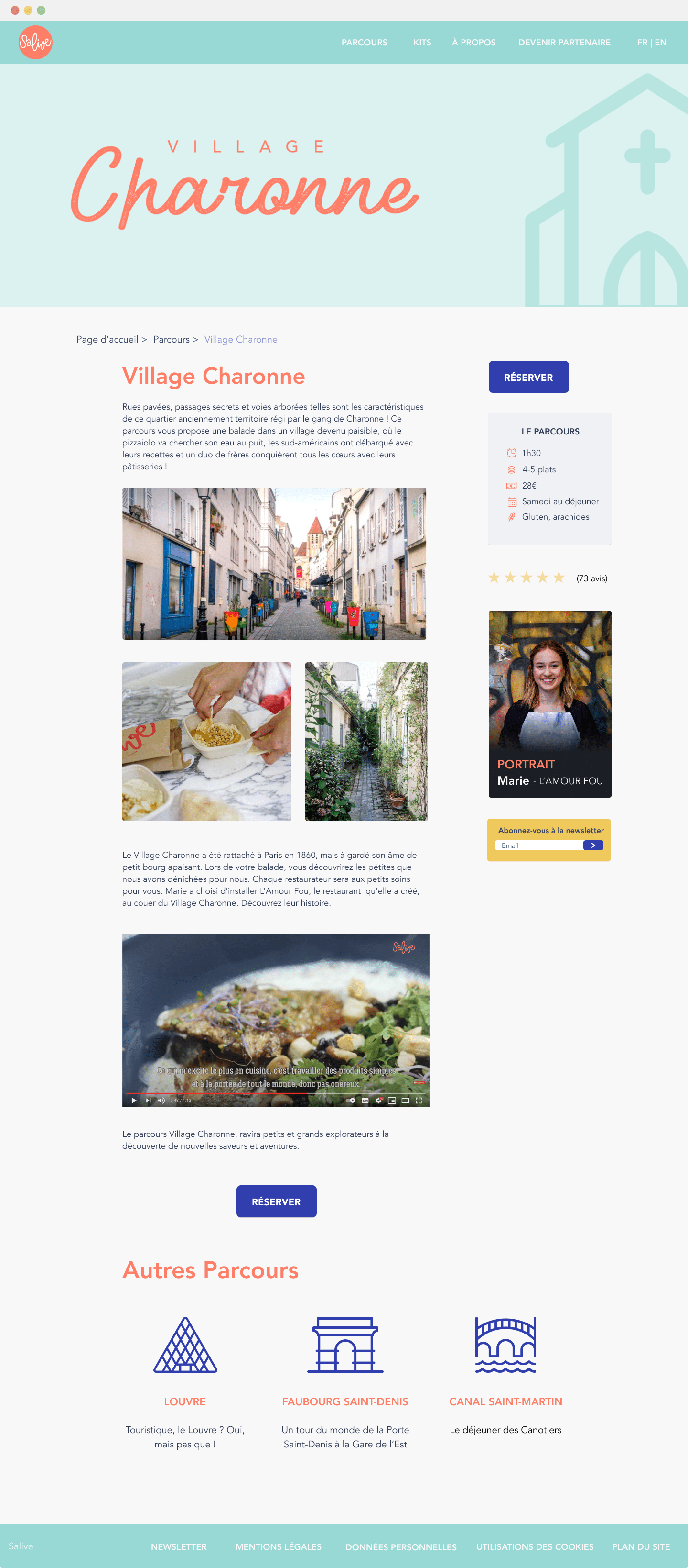
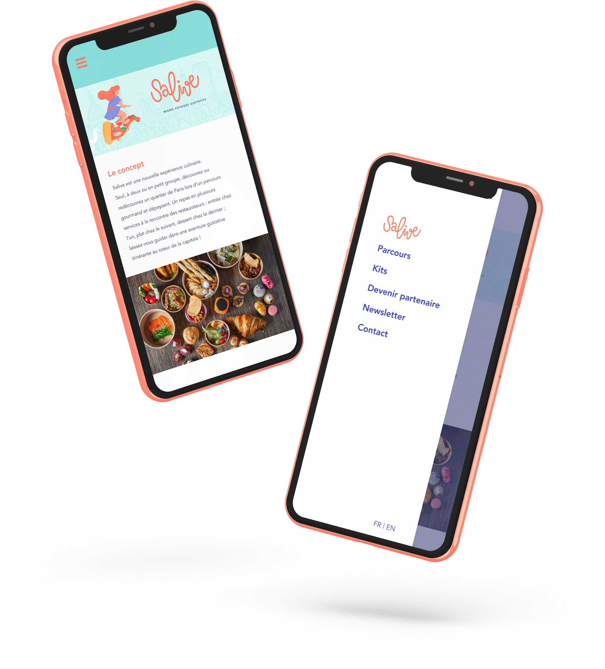
Everything has been created in a responsive format, so that users can navigate the website wherever they are.
Next steps ?
During our project, we also thought of integrating a second persona, the restaurant owners. Following the example of Über, we thought it would be interesting to allow food professionals to be able to propose their establishments to Salive in order to simplify the selection process for the founders. It goes without saying that it would be desirable for them to correspond to the values of the brand, but as users have told us on several occasions that they have appreciated being in contact with them, why not include them more in this adventure?
Furthermore, we think it would be really useful to create a native application to, for example, integrate a map as well as informations about the itinery ("You can sit down to eat in this park", "the church next to you was built in 1531"...), a rating system so as to be able to collect people's opinions quickly and to allow the founders to be able to bounce back better in the event of unforeseen events or restaurants that do not correspond to Salive values.
In short, this topic was very inspiring and we had a lot of fun working on it.
