KAMIMO PRODUCT DESIGN | UX | UI
Netflix Shopping
Year: 2021
Duration of the project: 1 week
Mission: Adding a feature in an existing app
Role: UX designer
Year: 2021
Duration of the project: 1 week
Mission: Adding a feature in an existing app
Role: Product designer
This project took place during my bootcamp at Iron Hack in the summer of 2021. I didn't work directly for Netflix, this is a course exercise to learn how to break down and replicate an existing UI.
During this project, I had to analyze an already existing and highly adopted app and incorporate a new feature into the existing product, I had to come up with a concept, research its desirability, deconstruct the ui of the application, and finally find a way to integrate the feature that didn't mess with the user experience..
I quickly thought of Netflix for this project, because I'm a big user of the platform, like everyone else my age, but also because on a very personal level, I've found myself quite frustrated on a number of occasions not knowing where to buy certain clothes or items featured in the series I binge watch at weekends.
Would a purchase feature in Netflix be a good idea? I like it, but I don't forget that I'm not designing for myself.
I need to test the waters and understand a little bit about what the users are expecting.
Interviews
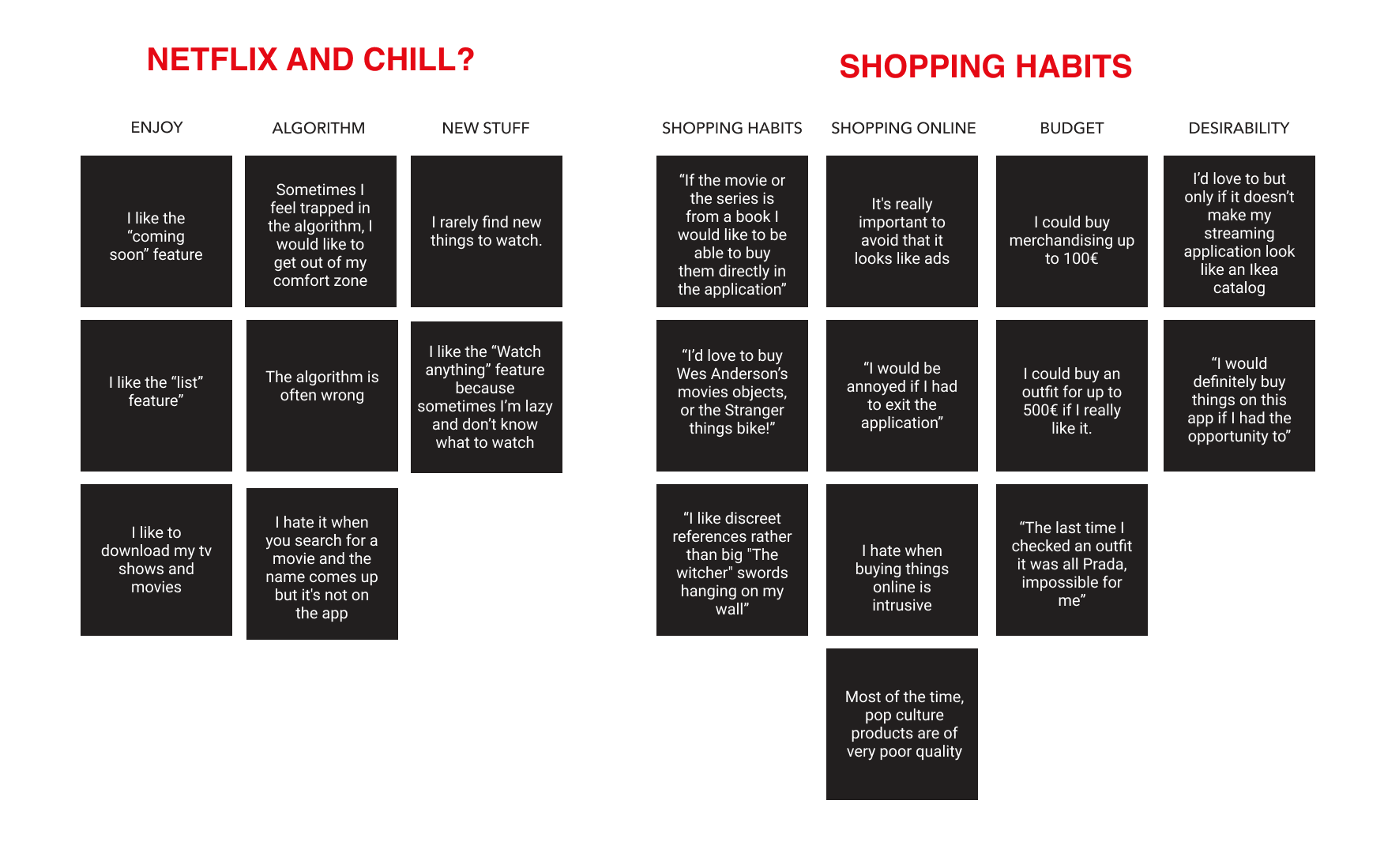
Before doing anything, I had to define the needs and frustrations of Netflix users, so I interviewed 6 people to find out more about their consumption of streaming programmes as well as how they buy online. After talking to the interviewees, I created a quick user archetype, so I could better put myself in their shoes.
Proto persona

Goals
- To dress like the actresses of her favourite programs
- Having discreet (or not) pop culture references in the decoration of her home
- Having quality products that don't look cheap but still fit into her budget
- Be able to put her creativity to work by drawing inspiration from her favorite programs.
Frustrations:
- Wants to enjoy her streaming experience without interruption
- Receiving an item that does not look like the one on the website or app
- Don't like to be overwhelmed by intrusive advertising
“ Netflix was design to stream movies and tv series, however we noticed that users like to collect products and merchandising from their favorite streaming programs. How might we integrate a shopping feature into the application that is not invasive and does not look like advertising? ”
“ Netflix was design to stream movies and tv series, however we noticed that users like to collect products and merchandising from their favorite streaming programs. How might we integrate a shopping feature into the application that is not invasive and does not look like advertising? ”
User flow
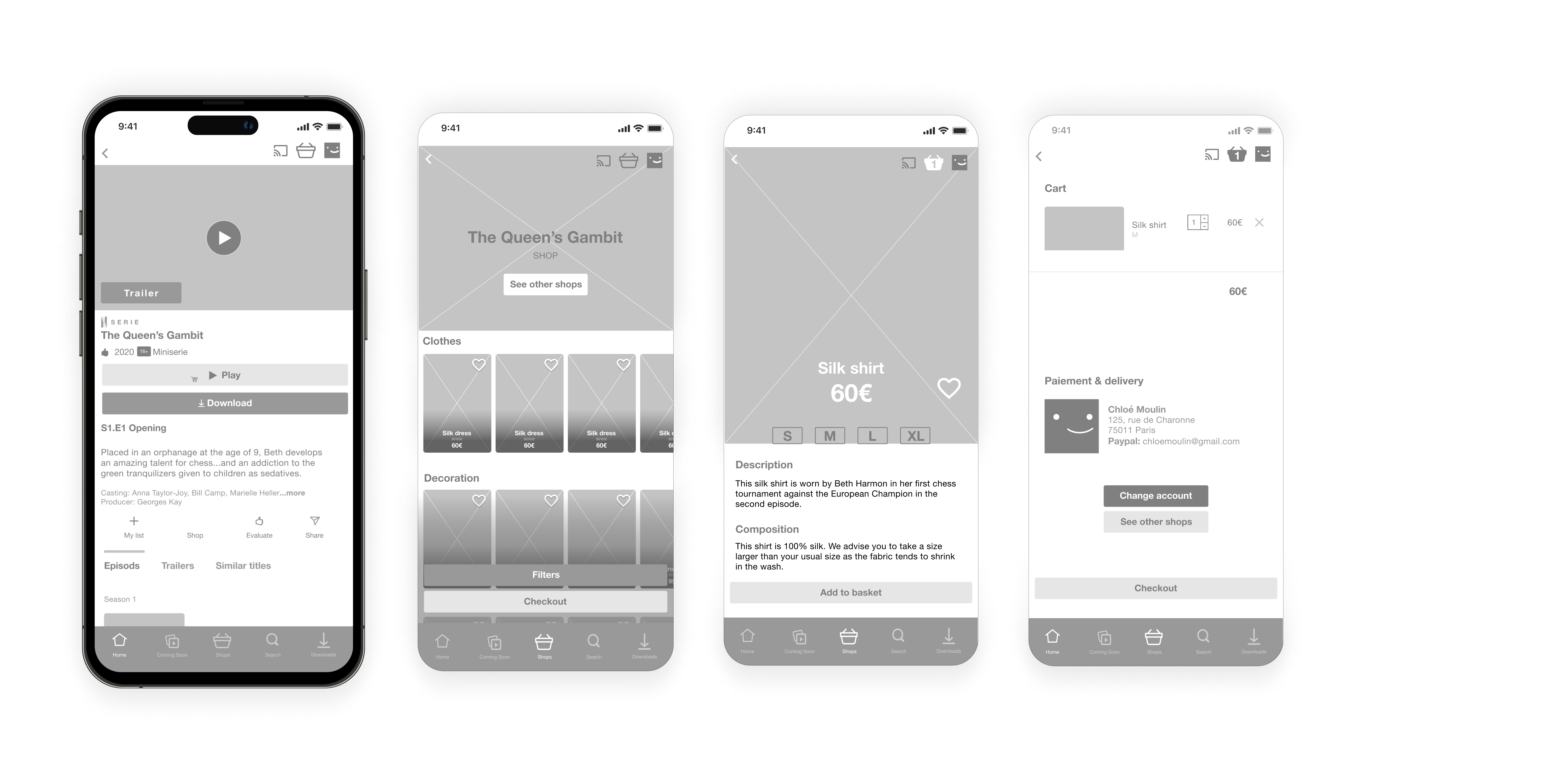
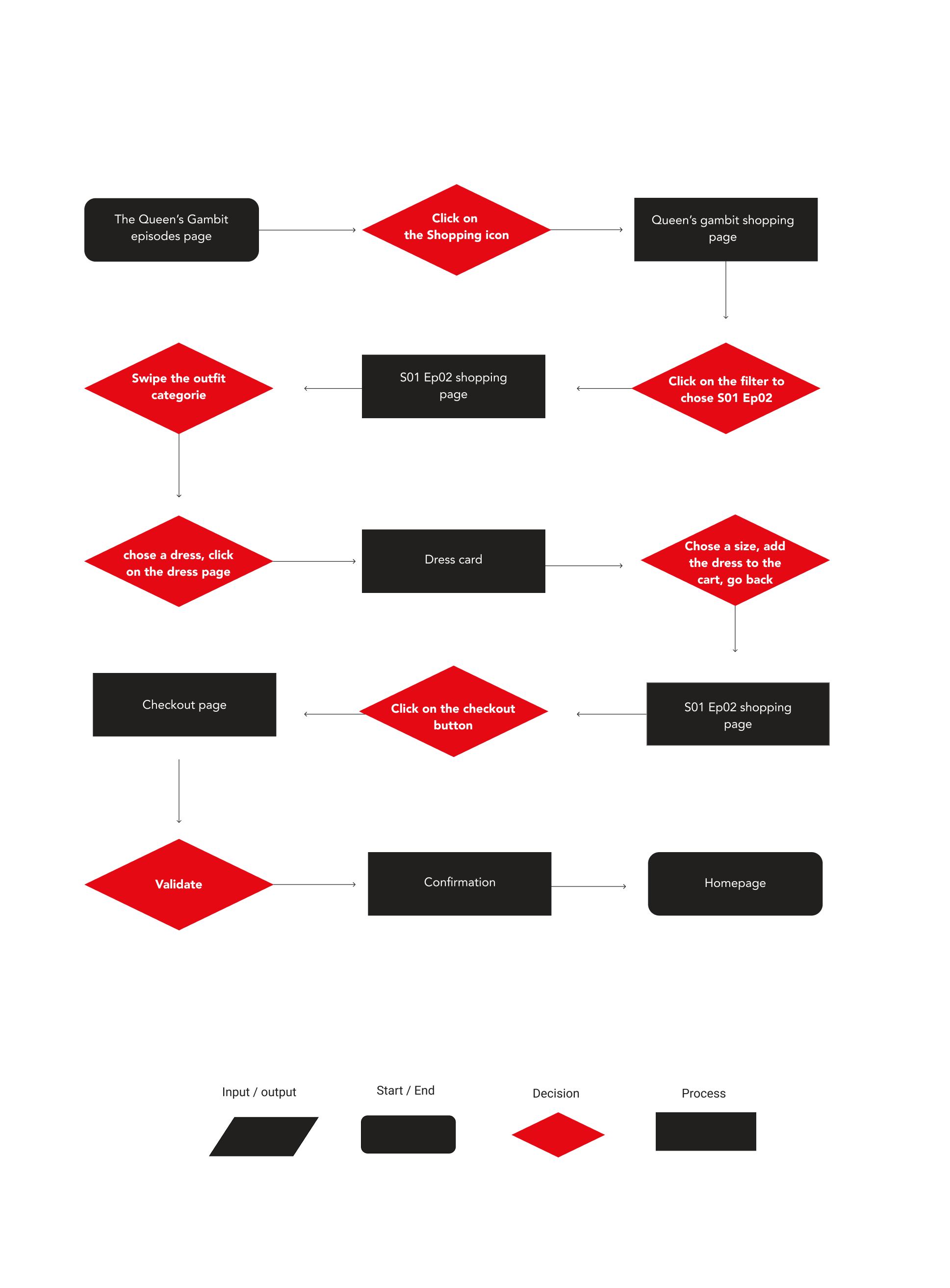
User Flow allows designers to understand and anticipate target user behaviours in order to create sites or applications in line with these behaviours. Here I have created the ideal user journey for my user who wants to buy a dress she saw in the TV show "The Queen's Gambit".

New features often mean new icons. A basket will be added to the application.
Prototypes
Medium fidelity
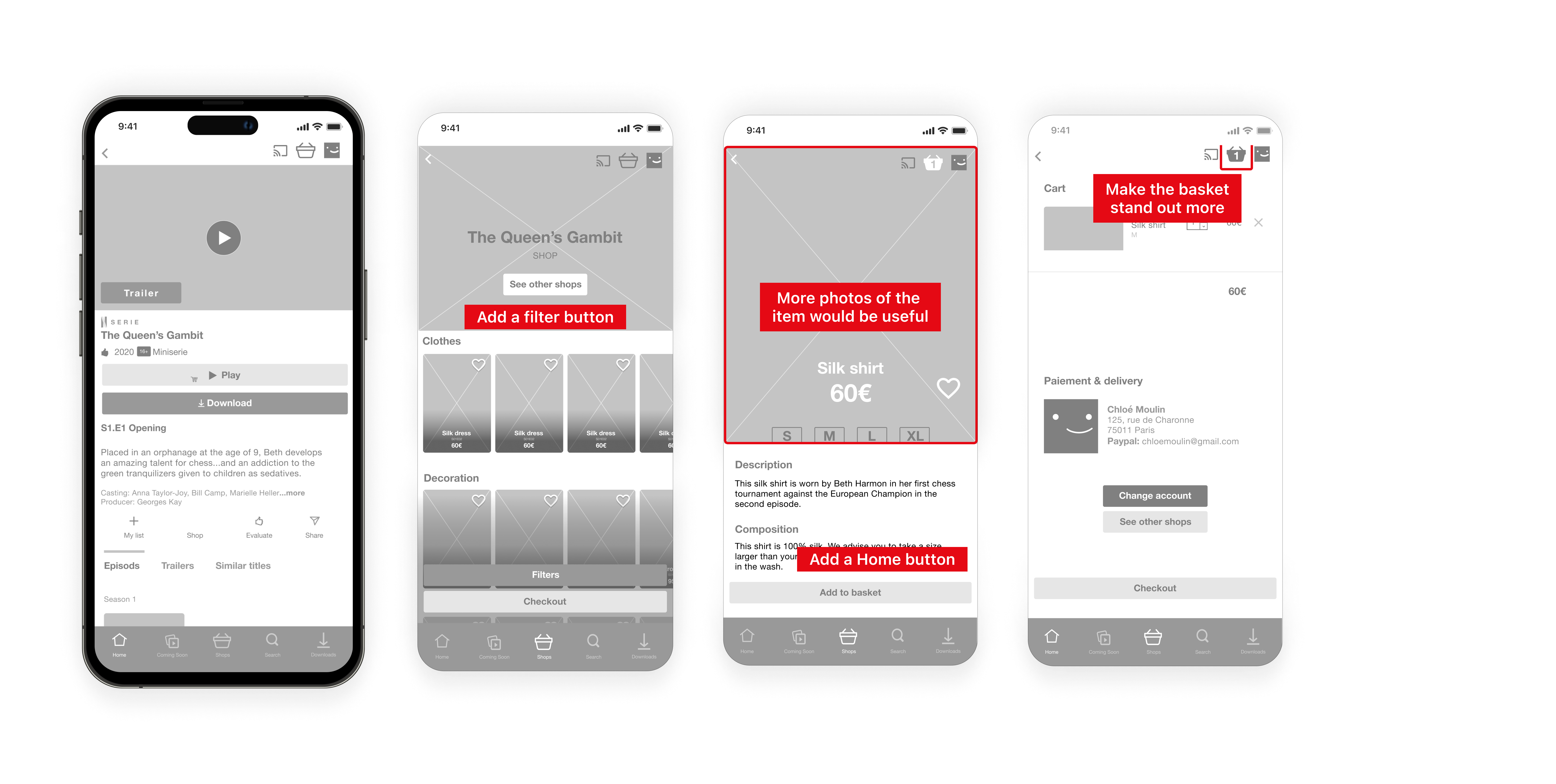
After a few quick sketches, I proceeded with the "medium fidelity" wireframes, and tested them again with users. They were very useful because when you're completely absorbed in a project, a fresh eye is never too much, as I had forgotten some basic navigation principles.
High fidelity
High fidelity
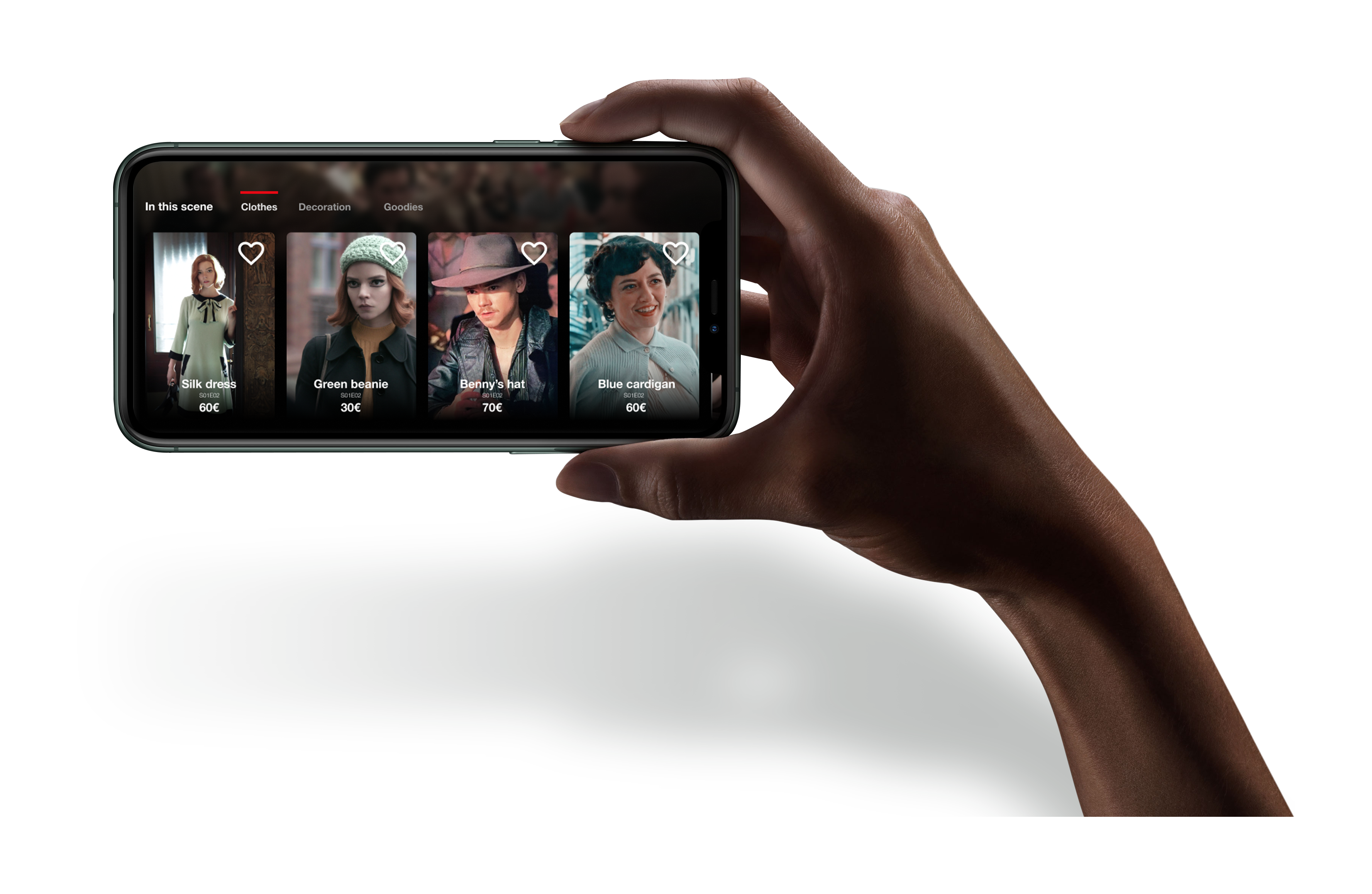
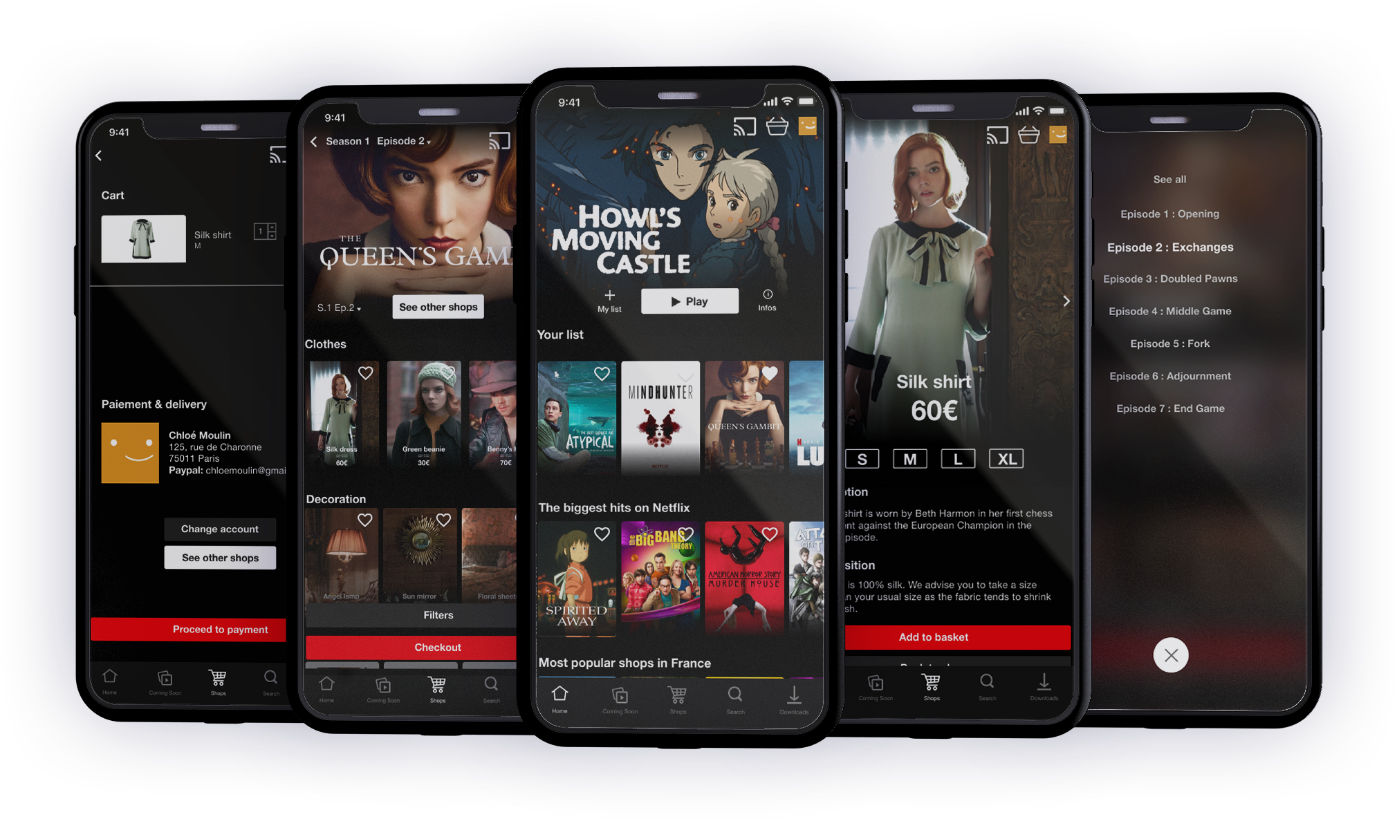
After adjusting the prototypes, I integrated the UI to arrive at high-fidelity prototypes and finally realized what my new feature might look like in the application.
After adjusting the prototypes, I integrated the UI to arrive at high-fidelity prototypes and finally realized what my new feature might look like in the application.
Next steps?
Integrate the feature into the stream, like Amazon Prime Video’s Xray function. I’ve been practicing a bit already and plan to dethrone Jeff Bezos’ version!
